LIMBURG
- 1 day ago
- 8 min read


Limburg is a province where the Netherlands suddenly becomes contoured: hills, vineyards, Maastricht and landscapes that stubbornly defy the country's usual "flatness".
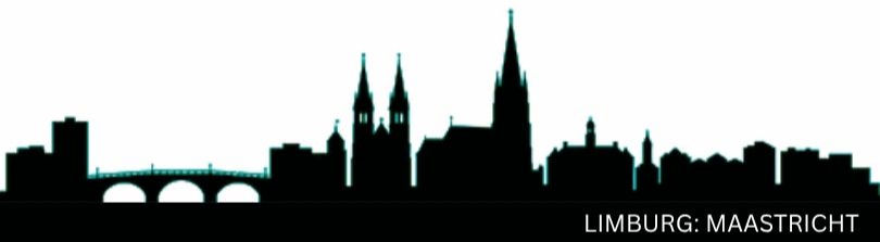
LIMBURG: ICONIC LANDMARKS
Here, underground passages, hills, and towns with character create the feeling that you've left the Netherlands just a little bit, but still technically.

Limburg is a rare case where geography itself sets the tone for the journey.
It's logical to start with Maastricht: a city that looks like it long ago agreed to live by its own rules with Europe. Here, Gothic churches rub shoulders with designer shops, and a bookstore in a former Dominican church isn't a metaphor, but an address.
A stroll along the Maas River and Vrijthof Square provide precisely that sense of "southern" that people come here for.

Just to the north is Roermond, home to the largest outlet mall in the Benelux region, where shopping unexpectedly becomes a sport. Heerlen is responsible for the contemporary: street art here isn't a backdrop, but a full-fledged layer of the city's identity.
But the real intrigue lies outside the cities. Three national parks create different rhythms: Maasduinen with its river dunes, De Groote Peel with its birdlife and the silence of its marshes, and De Meinweg with its almost geologically dramatic terraces.
And finally, the south: Heuvelland with its rolling hills, vineyards, and Valkenburg , where tourism began to be systematized back in the 19th century. And in Drielandenpunt , you can literally step into another country (Germany or Belgium, your choice). Which always makes an impression, and what an effect.
LIMBURG: COAT OF ARMS' HISTORY
How one lion found himself at the center of a complex family chronicle spanning five territories and managed to stay afloat.

Limburg is a province with a complex history: geographically in the south of the Netherlands, historically at the intersection of empires, dynasties, and interests. These lands were part of the Holy Roman Empire, then divided between the Netherlands and Belgium, and after 1839, they were finally consolidated within their current borders.
Unlike many regions, Limburg wasn't so much formed as assembled from various parts. Its coat of arms is a direct reflection of this assembly, neatly packaged within a heraldic system.
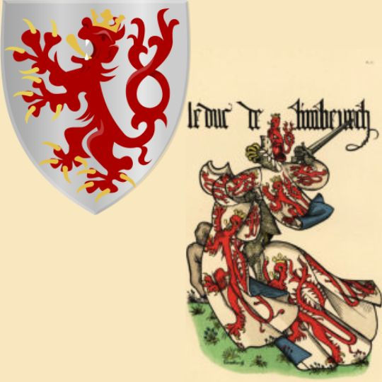
The Duchy of Limburg emerged from a county in the 11th and 12th centuries, when local rulers fought for the title of Duke of Lower Lorraine. The struggle was formally lost, but the title remained — a rare case of a status surviving the outcome of the conflict.
The first known coat of arms appears in the early 13th century : a lion is depicted on the seal of Count Henry III. Later, his son Walram III added a crown and a second tail. The latter is usually explained simply: he ruled two territories — Limburg and Luxembourg. The colors were quickly and permanently established: a silver field and a red lion with a forked tail .

Although heraldry is not an exact science, it does have a strict logic and a stable set of terminology. In the case of Limburg, we are dealing with a composite shield . The division is vertical, the intersection is horizontal. Their combination produces the classic division into four parts, each of which is called a quarter.
But the Limburg coat of arms goes further: above these four parts is an additional element — a small shield, or heart of the shield. This central element performs a special function: it indicates the key territory or family around which the entire composition is built.
This could be the ruler's personal coat of arms, a symbol of a dominant region, or a reminder of the origin of power. The description of such a coat of arms is constructed in a strict order: first the central shield, then the first, second, third, and fourth quarters. This is why the Limburg coat of arms reads not like a picture, but like structured text.
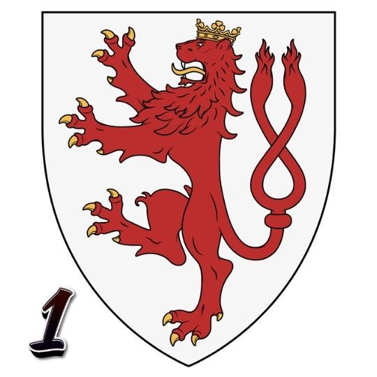
Now, armed with this knowledge, let's get to work. In the center (the heart of the shield) is Limburg itself: a silver field with a red lion with a forked tail — the direct legacy of the duchy. This is the core of the entire composition.
In the first quarter is Valkenburg . Historically, it is closely associated with the House of Limburg, so its lion is almost identical to the central one — a kind of "family version."

In the second quarter is Jülich: a black lion on gold — a reference to the neighboring duchy, whose interests here were quite specific. This region found its way into the coat of arms through political and territorial ties to the east of the province, particularly the Borna region.
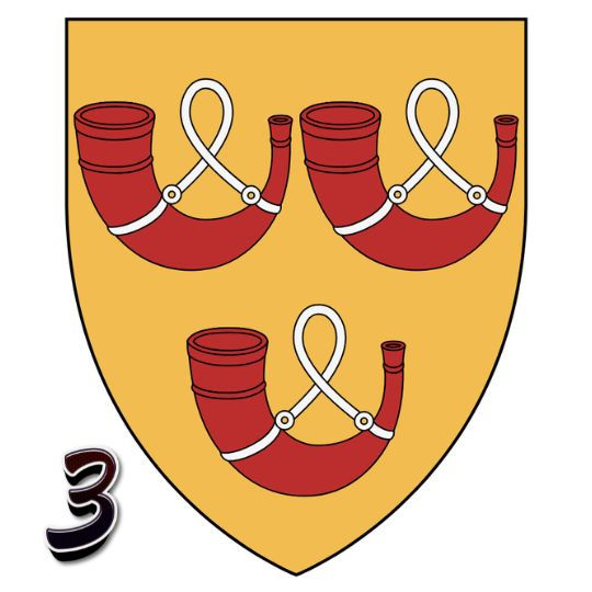
The third quarter is the Horn: three red horns on a gold background. Here, heraldry literally speaks to us in living language — a classic example of a "talking coat of arms." It is a direct symbol of the local county, compact yet persistently present in history. The horns entered the province of Limburg through the Weert region, the western part of the former county of Horn.

The fourth quarter is Gelre: a golden lion on a blue field with a double tail. Gelderland's influence on northern Limburg has always been too significant to ignore. The lion entered the province of Limburg through the former Gelderland region around Venlo.
Thus, the coat of arms is not a decorative set of symbols, but a map of historical influences, carefully compiled into a single system. Looking at the map, you can see that today's province of Limburg is only a fragment of these historical territories. The square kilometers have shrunk over time, sometimes quite dramatically. But the coat of arms compensates for this: here, Limburg remains "in its entirety," carefully assembled from its past incarnations.

For heraldists, the Limburg coat of arms is practically a textbook: it has everything — hereditary symbols, territorial layers, compositional logic. For the casual observer , it's "expensive and complex": lots of lions, few horns, and a sense of something truly important. The paradox is that, despite all this complexity, the coat of arms remains harmonious .
The various elements don't clash, but coexist—almost like the historical regions from which it is composed. And yes, there's something about this reminiscent of that very photo of four tigers of different colors: all seemingly different, yet together they look suspiciously organic. The only difference is that the Limburg coat of arms is not an experiment in nature, but the result of several centuries of careful (though not always voluntary) collaboration.
LIMBURG: FUN FACTS
Of how love learns to bypass walls and architecture pretends they were never there.
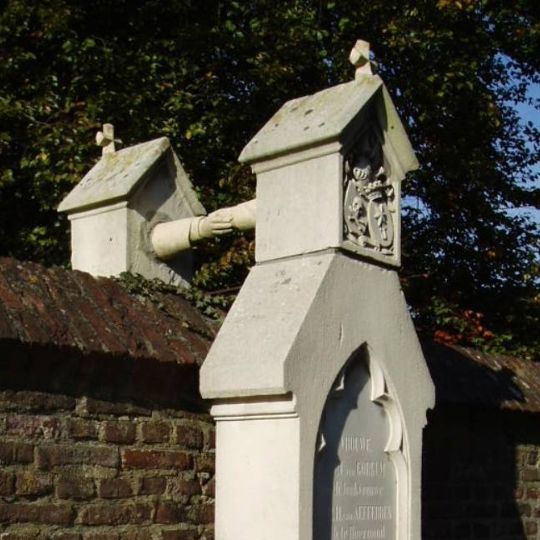
There's a cemetery in Roermond where architecture once decided that faith was more important than love — and built a wall between them. Literally. In the 19th century, Protestants and Catholics were buried separately, on opposite sides of a carefully calibrated boundary. Colonel Jacobus van Gorkum and his wife, Josephine van Aefferden, lived together despite everything that was then considered "inappropriate": different faiths, different social statuses, different ages.
After his death, he was buried among Protestants. She was supposed to be among Catholics. She found a solution that seems simple but in fact requires rare stubbornness: two tombstones were placed on either side of the wall. And they were connected by stone hands reaching out to each other across the boundary. Since then, it has become less a monument to death than a stubborn geometry of love.

Not far from here, in Borgloon, there's a church you can enter and still remain outside. It's called "Reading Between the Lines," and that's perhaps the most apt name for the building. The architects constructed it from hundreds of thin layers of steel. From a distance, it's a familiar silhouette: a tower, a nave, almost Gothic. But come closer, and the walls dissolve. Light passes through them, and so does the wind.
There's no familiar boundary between "inside" and "outside." It's as if the architecture decided not to argue with reality, but to gently clarify it. If the first story was about people reaching through a wall, then this one is about a space that refused to build it in the first place. And perhaps that's why, after a while, it's not the form, the metal, or the cemetery that comes to mind. But the feeling: something important can be held on to, even if everything around is built against it.
Sometimes it seems like it takes centuries for people to understand a simple thing: walls are temporary. And then places appear where they are built... to show how easy it is to pass through them.
LIMBURG: LOCAL HERALDRY
When symbols behave strangely: snakes form a cross, and lions and anchors seem to disappear mid-sentence.
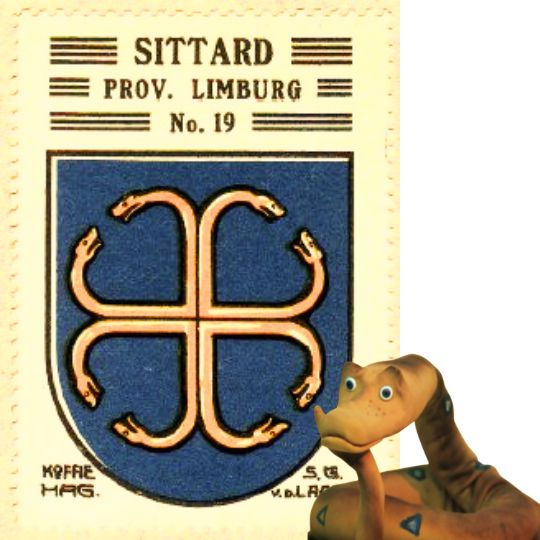
Sittard is one of the oldest cities in the country, but its history is not so much ancient as fractured. The 17th century left a mark here that can hardly be called a mere "episode": the French sieges of 1676–1677 methodically destroyed the city — looting, fires, filling in canals. Much was rebuilt, but the feeling of vulnerability remained forever.
The Sittard coat of arms behaves much the same way: it exists, but its meaning eludes. All that is known for certain is that it derives from the coat of arms of the knightly family of Heun van Amstenrade, known in the land of Valkenburg since the 14th century. However, where did these pious knights get such a, one might even say, provocative symbol?
A cross composed of eight serpent heads, curved inward, as if they simultaneously protect and enclose space. There are more interpretations than certainties: it represents the caduceus (the staff of the Roman god of commerce, entwined with two snakes and crowned with wings), the balance of opposites, the Christian victory over evil, and alchemical duality . Unable to find an answer, the modern coat of arms was simplified — the cross was stylized into a chevron, the colors were changed to yellow and black. But the feeling remains: this is a symbol that has endured too much to be explained definitively.

Venlo is a city with a carefully constructed biography: ancient roots, Hanseatic trade, Spanish and French influence, and a frontline role during World War II. All of this is evident in the coat of arms, and at first glance, it's obvious: the yellow and blue Gelderland lion, as a symbol of this region, and the anchor, a symbol of river trade and profitable ties with the Hanseatic League.
But upon closer inspection, a strange sensation emerges. The lion seems to be "torn" — its double tail doesn't so much proudly split in two as lose its integrity. The anchor at the bottom appears not as a solid support, but as a symbol disappearing into the water. Attempts have been made to explain this by the historical shifting of elements from seal to seal, sometimes to the point of complete abrasion (from frequent use). But graphically, intrigue remains — the coat of arms seems to capture not stability, but process. Overall, the coat of arms draws the eye, which distinguishes it from the mild monotony of Limburg heraldry.


Comments